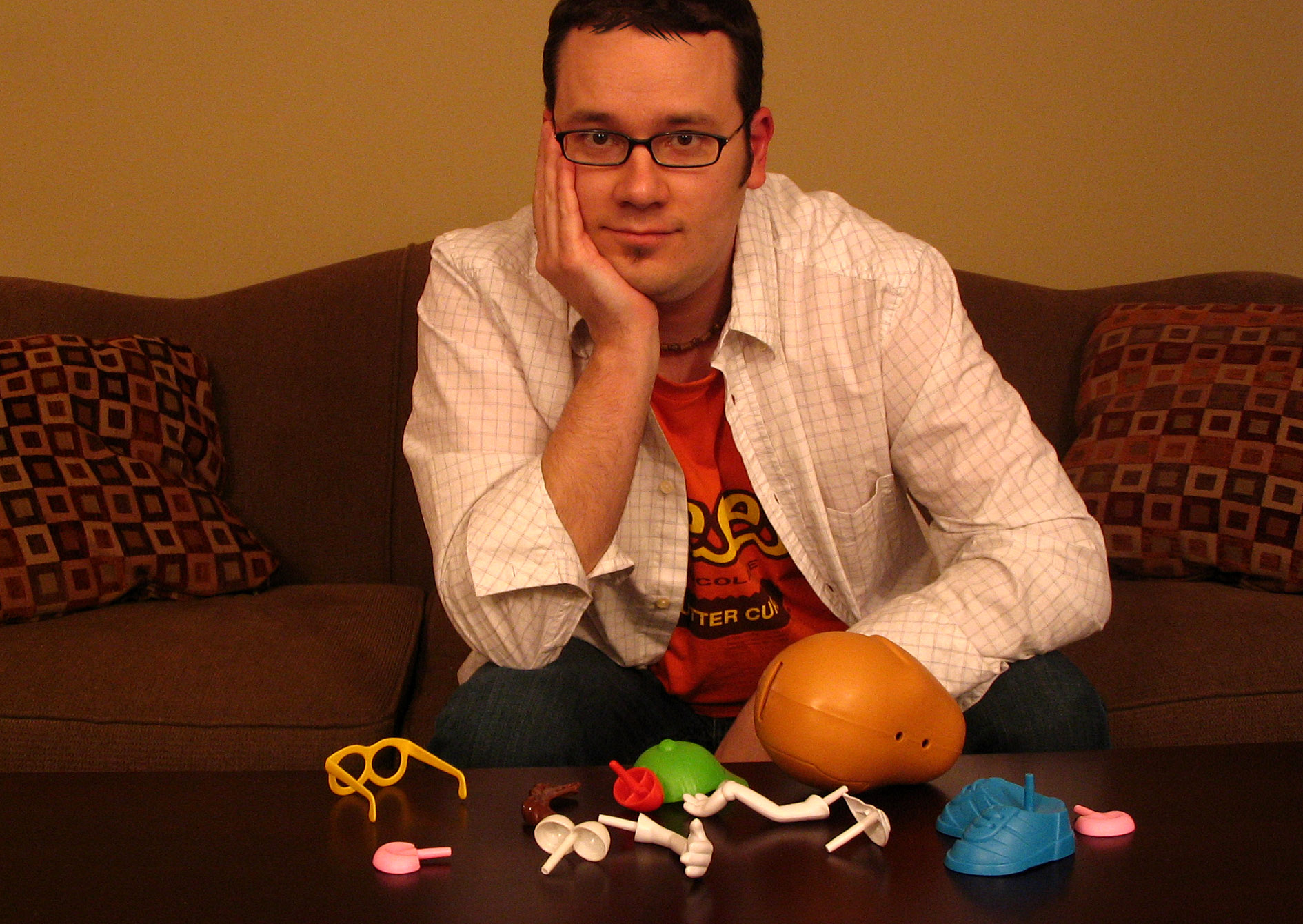
 After the final tweaks had been finished, I got a chance to ask webmaster Jason a few questions about the new design for KimandJason.com.
How many times has the Kim & Jason website been redesigned?
Oy. Lots and lots of times. I’m sure a visit to the Wayback Machine would uncover about a dozen or so versions. Our business has changed a lot over the years which requires a constant evolution. Also technology has made quite a few advancements as well. For instance, our blog started out as a simple thread called “Bird Droppings” in a bulletin board forum.
Once blogs were officially invented, we launched one on Typepad and them moved over to WordPress, which I love so much I’d want to marry it. (Too bad, WordPress, I’m taken.) Now, pretty much our entire site is built in WordPress, which didn’t even exist when we started out. Crazy.
Was there anything in particular that inspired part or all of the new look?
Well, the paint colors in our new office played a big part.
I’m also tired of the overly shiny “Web 2.0” look you see everywhere. I wanted something that felt a little bit homemade, with little touches that remind you of childhood. I seem to always take pieces of the old designs and implement them into the new ones. Not sure if that’s because they worked or because I’m lazy.
What is you favorite part of the redesign?
I definitely like the colors. They’re bright and sunny, and reminiscent of childhood without beating you over he head with the standard primary colors you’d see in a kindergarten classroom. I’m also happy that the site is SO much easier to maintain and update.
But my favorite thing is the little Chalkboard icon that tells you how many comments are on a post. I think that turned out pretty neat.
Do you have words of wisdom for other folks looking to redesign their websites?
I side with Einstein, who said, “Things should be made as simple as possible, but not any simpler.” Also, keep your font selection limited. No more than three. Oh, and stuff Comic Sans in the trunk of your car, drive to the desert, and bury it fifty feet under some rock.
Any new features you want to point out?
I think the Art Gallery section is pretty sweet, particularly the paintings, sketches, and Weekend comics. The Tools section offers up a nice directory of some of the things people can access to Escape Adulthood.
Thanks Jason! Be sure to take a peek at the past in the gallery of screen shots below and also check out all the cool new stuff here at the KimandJason.com!
[autoviewer id=”7″ width=”450″ height=”300″ ]
