The journey of creating a magazine cover
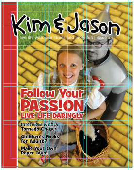 We really had a lot of fun with this cover, going with a full-blown Wizard of Oz theme. It required a lot more effort and Photoshop savvy than previous issues — and the Tin Man costume was really HOT — but I think it turned out pretty well.
I’ve written up a little behind-the-scenes look at how the magazine cover was shot and digitally, um, enhanced.
The first step, once we decided to do a Wizard of Oz-themed cover, was to track down the costumes. Originally, the idea was for me to be the Scarecrow, but Kim suggested that the Tin Man would be more appropriate, as his search for a heart was a better link to the idea of passion. Jenna was able to procure an authentic Dorothy costume from her family. Meanwhile, Kim scoured the internet and local costume shops for a good Tin Man outfit. Some of them were so bad we wondered if the people making them had ever even seen The Wizard of Oz. Kim badly wanted me to try on one costume that heavily relied on spandex as its main source material. I declined.
We finally found a decent Tin Man costume to rent — at least one I felt I could work with in Photoshop — and we purchased a plastic funnel hat and heart clock. We did the photo shoot in the office. Doug was the photographer, and he had to stand on a table to get the right angle. Jenna stepped in as prop manager, lighting assistant, and costume attendee — she’s multi-talented!
We took over 50 photos, with a variety of poses, and loaded them into the computer to decide on the right one…
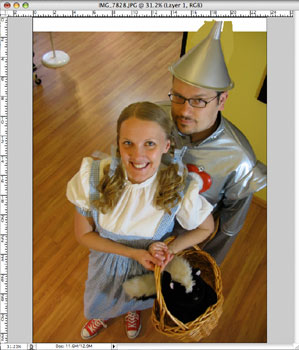
Step 1: One picture seemed to be better than all the rest: it was in pretty good focus, Kim’s red slippers (I mean Chuck Taylors) were visible, Stinky was in a good spot, etc. The only problem was that a bit of the Tin Man’s hat was cut off. In order to make sure we had plenty of space for the masthead on the final cover, I brought in another photo that showed more of the hat, and blended it together with the original photo.
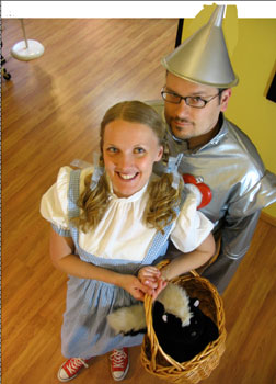
Step 2: The next step — mostly unnoticable in this photo — was to sharpen up the photo and clean up any little problem areas (such as a major zit on Dorothy’s face.)
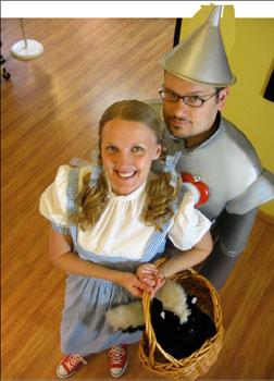
Step 3: Here you can see the photo retouching I did on the Tin Man costume. I cleaned out the wrinkles, straightened out the sleeves, and generally just made the suit more stiff and metallic looking. A good understanding of light and shadow came in handy here.
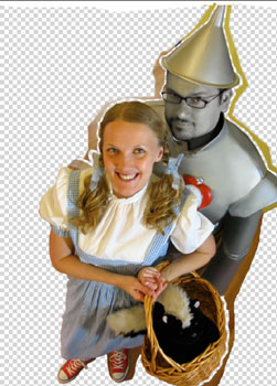
Step 4: In this step, I gave myself a silver face. Much easier (and cleaner) than having to mess with real makeup, I began by creating a new layer in Photoshop with a copy of just my face. I brought the saturation way down so that it was almost completely black and white. Then I had to carefully paint in some light washes of the yellow ochre on the side of my face so that it matched well with the hat. Finally, I utilized the “Noise” filter to add a bit of speckling to make my face look metallic.
Also, since Dorothy and friends didn’t travel to Oz on a hardwood floor, I had to carefully remove the background from the original photo. It was important to use an eraser with a blended edge, to make sure the outlines were soft. Otherwise, it would look like we were cut out of a magazine and taped to the background. Not quite what I was going for.
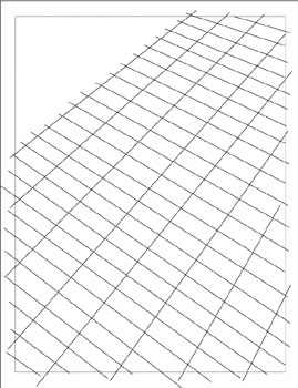
Step 5: Good thing I paid attention while they taught perspective in drawing class. I tried dropping in a photo of a brick road, but it looked terrible because the perspective wasn’t right. I knew then that I’d have to create my own yellow brick road. Ugh. Luckily, I could see some of the planks in the hardwood floor in the original photo, so I used it as a guide to help me create a grid in Adobe Illustrator.
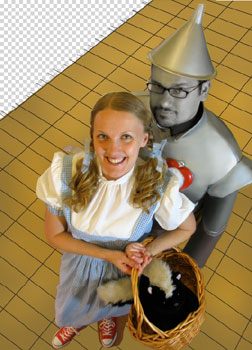
Step 6: I was then able to drop the grid back into Photoshop under the original photo and fill it in with a dark yellow base.
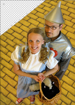
Step 7: Using the grid as a template, I began coloring in the bricks by hand (or mouse, I suppose), slowly layering up different colors of yellow. This was the most tedious and boring part of the whole project. By the way, for some reason, I had hidden the “Silver Face” layer and “Tin Man suit” layer, which is why you can see the original elements of the photo in this screenshot.
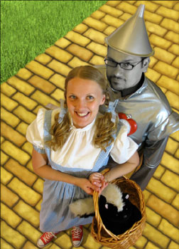
Step 8: Some finishing touches included more color and detail on the bricks. I also darkened and lightened some of the bricks and added some texture filters to make them appear more lifelike. Then I dropped in a photo of grass, while painting a few blades over the bricks to merge them together more realistic. I also added in the shadow under Kim.

Step 9: The key to bringing it all together in the final piece was subtly blurring the background bricks and the photo of the grass to make it all look like it is part of the same picture. If the background was sharper than the parts of the image that are closer to the camera, it wouldn’t look right. In the end, I don’t think I necessarily achieved super realism, but rather something a bit more fantastical which is based in reality. If that makes any sense.
This image shows the finished photo dropped into InDesign (my page layout software) with the masthead, copy, and design elements all positioned just so.


