The journey of creating a magazine cover We really had a lot of fun with this cover, going with a full-blown Wizard of Oz theme. It required a lot more effort and Photoshop savvy than previous issues — and the Tin Man costume was really HOT — but I think it turned out pretty well. I’ve written up a little behind-the-scenes look at how the magazine cover was shot and digitally, um, enhanced. The first step, once we decided to do a Wizard of Oz-themed cover, was to track down the costumes. Originally, the idea was for me to be the Scarecrow, but Kim suggested that the Tin Man would be …
Club K&J Christmas Premium (Part 3)
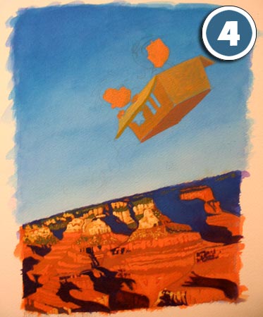
Well, the Club K&J limited edition print is finished. (At least the painting part of it.) I finally got to the part of the painting where I start getting really excited, where things are coming together and I get the feeling that I'm actually going to pull this off. With the help of my newly purchased tube of titanium white, I was able to start plugging away on the highlights of the canyon, giving it a sense of depth and texture. I am amazed that even though it's been months -- maybe a year? -- since I picked up a paintbrush, the experience is very much like riding a bicycle after a long …
Club K&J Christmas Premium (Part 2)
Yesterday I had the chance to get started on the painting aspect of the Club K&J limited edition print. I went to the art supply store to get a watercolor block, which is a block of 20 sheets of watercolor paper bound together. As you may remember from art class in school, adding water to paper makes it buckle like a dress shirt in a gym bag, leading to lots of unwanted pools of pigment. In order to avoid this, you have two options: stretch the paper (which involves expanding it by submersing it in water and taping or stapling it to a board so that when it dries you have surface that stays …
Club K&J Christmas Premium (Part 1)
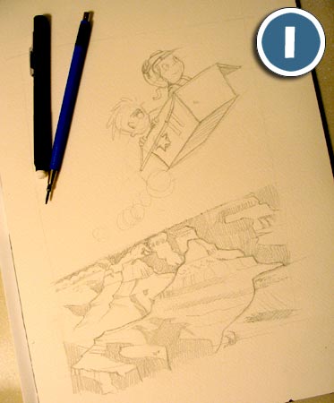
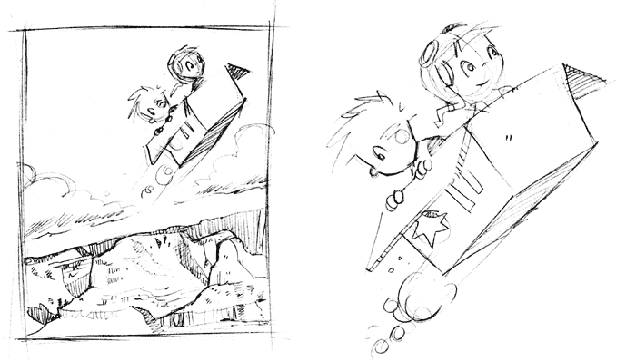
I've been thinking about this year's Club K&J Christmas premium -- a limited edition print -- for quite some time now. I wanted to come up with a meaningful theme for the artwork, so I spent some time reflecting on the past year. One of the highlights of this year for Kim and I was our first ever trip to the Grand Canyon. I remember standing in awe before it, marveling at the magnificent play of light and shadow. I even mentally tried painting it in my mind, as I began to notice the full range of colors lit on fire by the sunset. …
The Lost Panels
A long time ago in a galaxy far, far away, I submitted a comic idea entitled Kim & Jason to the Northern Star, the campus newspaper of Northern Illinois University. It was very different from the Kim & Jason you're familiar with today. Other than being drawn in a panel format, the comic was very, very BAD. Horrible. Worse than your worst nightmares. The characters have distinctly alien features, and frankly, I'm surprised that anyone even encouraged me to keep drawing them. Maybe they knew things could only get better. I don't even know why I'm posting these early attempts …


