Let me begin by saying I am not Ansel Adams. Most of what I know about photography came from an introductory class I took in college. However, that class was part of a bachelor’s degree in the fine arts, which gave me me an extensive knowledge of graphic design. Of course, an in-depth familiarity of all your camera’s bells and whistles can take your photos to a whole new level. But if you understand a little bit about design, you can make great photographs.
You don’t have to be employed by Sports Illustrated in order to get great shots of your kids. I believe that every regular Dad has the ability to create some memorable gems using a regular old point-and-shoot camera. These five simple tips will help your photos go from boring to breathtaking.
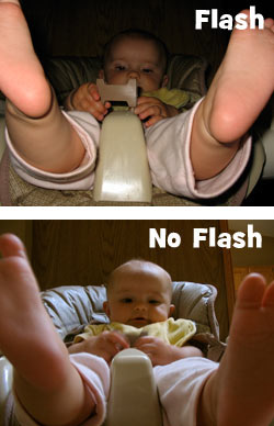
1) Kill The Flash
 If you only open your camera’s instruction manual one time, may it be to learn how to turn off the automatic flash. It’s evil. Sure, it’s useful for dark environments, like birthday parties and spelunking adventures, but it will absolutely ruin a Kodak moment of your toddler playing with blocks while the late afternoon sunlight softly cascades down on her.
Flash has no doubt ruined billions of photos by washing out all the pure light and color while creating a fake shadow around the subject. Turn that puppy off and you’ll immediately start to see your photos take on a more natural, appealing look.
One caveat to keep in mind: the less natural light there is, the better chance of your photo turning out blurry due to camera shake. You can improve your odds by bracing your elbow against something in order to keep things steady. You could also buy an inexpensive tripod as well. I like this one.
2) Obey the Rule of Thirds
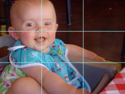
 This handy design guideline is the ticket to photos that are way more visually interesting and energetic. In the words of all-knowing Wikipedia:
The rule states that an image should be imagined as divided into nine equal parts by two equally-spaced horizontal lines and two equally-spaced vertical lines, and that important compositional elements should be placed along these lines or their intersections.
Of course, the natural tendency of most human beings with a digital camera is to plop the subject right in the middle of the frame, creating a snoozefest of epic proportions. This is not deer hunting and your camera is not a gun; you’re not trying to capture your subject in the cross-hairs. Use the rule of thirds and start looking like a pro.
(Read the rest of this article over at Dad-O-Matic, a cool site for Dads, by Dads.)
[…] If you enjoyed this post, you might also find this one useful: Five Tips for Phenomenal Photos of Your Kids […]